Styles
–
Focus state
Use these focus state styles to let users know which element they're on and that they can interact with it.
WCAG 2.2: Make sure that users can successfully see where focus is currently placed.
What is a focus state?
Some people use keyboards or other devices to navigate through a page by jumping from 1 interactive element to the next. The focus state lets users know which element they're currently on and that it's ready for them to interact with.
Do not let user interface elements hide or obscure any content which has a focus applied, for example: sticky headers or overlaid cookie banners. This is to comply with WCAG 2.2 success criterion 2.4.11 Focus Not Obscured (W3C).
Our focus state styles
We've followed the GOV.UK design system's approach to focus state styles.
Like GOV.UK, we use a combination of yellow and black to make sure we meet the Web Content Accessibility Guidelines (WCAG) 2.2 level AA non-text contrast on any background colour on the NHS website.
The yellow has a high contrast with dark backgrounds and the thick black border has a high contrast against light backgrounds.
Link focus state style
When links are focused, they have a yellow background with a black bottom border. This helps the focused link stand out from the rest of the content on the page.

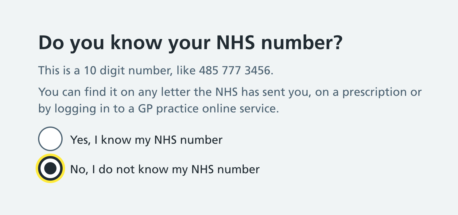
Form input focus state style
When form inputs are focused, they have a yellow outline and a thick black border. If the element already has a border, the border gets thicker.
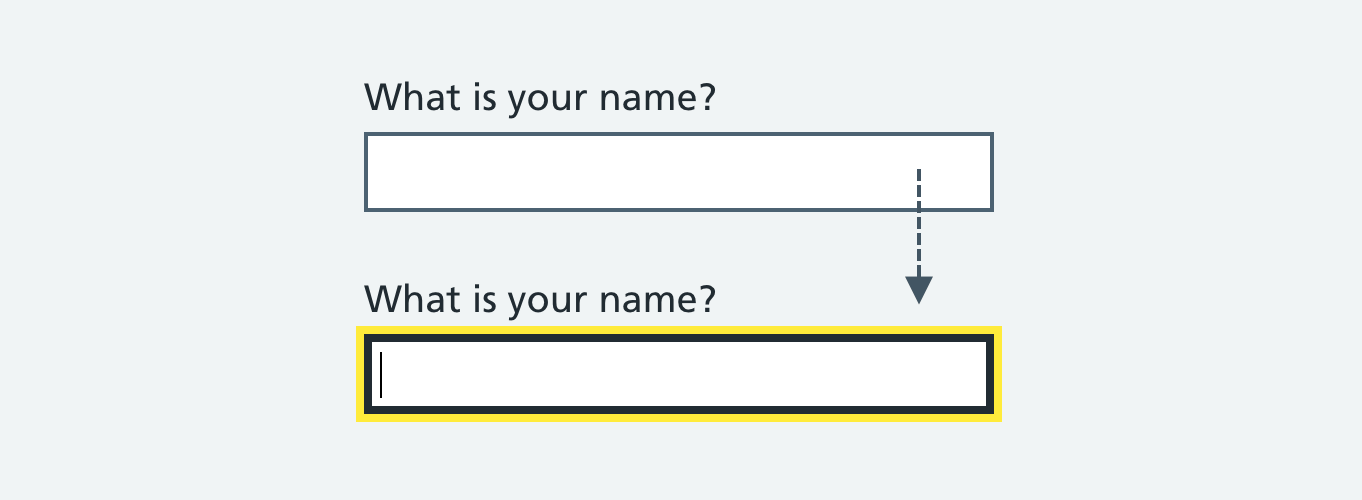
Radios and checkboxes use the same style.
Making focus states accessible for extended and modified components
If you've extended or modified components in the NHS digital service manual, you can use service manual styles to make the focus states of these components accessible.
How you make focus states accessible depends on whether the component is:
- focusable text without a background colour or border
- another focusable element with a background colour or border
Make focusable text accessible
If you use Sass, you should include the nhsuk-focused-text mixin in your component's :focus selector if that component is focusable text. For example, if the component is a link in body text, or the details component:
.app-component:focus {
  @include nhsuk-focused-text;
}
Make other focusable elements accessible
If you use Sass, you can use 3 NHS.UK frontend variables if your component has a background colour or border. For example, a text input, checkbox or icons and images used as links.
The 3 Sass variables are:
$nhsuk-focus-colour– yellow background$nhsuk-focus-text-colour– black text$nhsuk-focus-width– for consistent width
Use these variables in your components instead of numeric values for the background, text and widths.
If you do not use Sass
To make a component's focus state accessible without using Sass, you can:
- see how the
nhsuk-focused-textmixin works from the NHS.UK frontend source code - get the values for
$nhsuk-focus-colourand$nhsuk-focus-text-colourfrom the colour page
Help us improve this guidance
Share insights or feedback and take part in the discussion. We use GitHub as a collaboration space. All the information on it is open to the public.
Feed back or share insights on GitHubRead more about how to feed back or share insights.
If you have any questions, get in touch with the service manual team.
Updated: August 2025